
Mono-color Editorial Print 单色编辑印刷
Mono-color Editorial Print builds an entire visual system from one ink color, or a tightly controlled second printing pass: oversized editorial typography, deliberate empty paper, halftone imagery, dry grain, and slight registration drift are composed together as if the screen were a limited-run poster or magazine cover.
用一种油墨、编辑排版和复古印刷质感构成完整的视觉系统
Scope: This entry covers a contemporary editorial design system translated into digital surfaces and AI-generated visual work. It is not simply a monochrome photo filter. The defining move is to recompose type, image, spacing, and print artifacts as one constrained layout.
范围:本条覆盖当代编辑设计系统被转译到数字界面和 AI 视觉作品中的部分。它不只是把照片变成黑白;关键是把文字、图像、间距和印刷痕迹重新构成一个受约束的整体版式。
FIELD NOTE 07 / VISUAL SYSTEM
MAKE
SPACE
VISIBLE
A single ink can carry a whole point of view.
标本可交互,可以直接操作。
If you called it…如果你管它叫……
Full style DNA完整风格 DNA
-
One dominant ink单一主油墨 color defining定义特征
The visual is built from paper plus one named ink color. Tints come from dot density and overprint behavior rather than unrelated accent colors or gradients.
画面由纸张和一种命名过的油墨构成。浅深变化来自网点密度和套印行为,而不是无关的强调色或渐变。
-
Controlled second printing pass受控第二印刷色 color variable可变特征
A second ink may be introduced when the subject needs separation or emphasis, but it behaves like another physical pass and never expands into a full palette.
当主题需要区分或强调时可以加入第二种油墨,但它应像另一道实体印刷,不扩展成完整调色板。
-
Editorial type as image把编辑字体当成图像 typography defining定义特征
Oversized serif or condensed sans headlines become part of the composition: they crop, overlap imagery, change scale abruptly, and carry more visual weight than UI chrome.
超大衬线或窄体无衬线标题成为构图的一部分:它们可以裁切、压过图像、突然改变尺度,比 UI 外壳承担更强的视觉重量。
-
Large intentional fields of paper大面积有意识的纸张留白 layout defining定义特征
Roughly a quarter to half of the composition remains visibly quiet. Empty space creates tension, isolates the subject, and keeps the limited ink system feeling deliberate.
约四分之一到一半的画面保持安静可见。留白制造张力、隔离主体,也让有限油墨显得是有意的选择。
-
Halftone and dry-ink imagery半色调与干油墨图像 imagery defining定义特征
Photographs and shapes are reduced to visible dots, rough grain, uneven ink coverage, or screened tints that read as printed matter rather than polished photography.
照片和形状被转化为可见网点、粗颗粒、不均匀油墨覆盖或筛网色调,读起来像印刷品而不是精修摄影。
-
Restrained registration drift克制的套印偏移 depth supporting辅助特征
The optional second ink may sit one or two millimeters off the first pass at selected edges. The offset is localized and purposeful, not a global glitch effect.
可选的第二种油墨在局部边缘偏离第一道一两毫米。偏移应局部且有目的,不能变成全局故障效果。
-
Image and type recomposed together图像与字体一起重新构图 layout defining定义特征
The source image is cropped, screened, layered, or interrupted so it belongs to the typographic grid. The result is a new editorial composition, not a filtered source photo.
原始图像被裁切、筛网化、叠放或打断,以便进入字体网格。结果是新的编辑构图,不是给原照片套滤镜。
-
Generic AI polish千篇一律的 AI 精致感 imagery avoid避免
Glossy gradients, cinematic hero lighting, centered photorealistic subjects, neon glow, decorative glass cards, and filler badges dissolve the print constraint.
光泽渐变、电影式布光、居中的写实人物、霓虹光晕、装饰性玻璃卡片和填充徽章都会破坏印刷约束。
Often confused with: Risograph最容易混淆:孔版印刷风(Risograph / Riso)
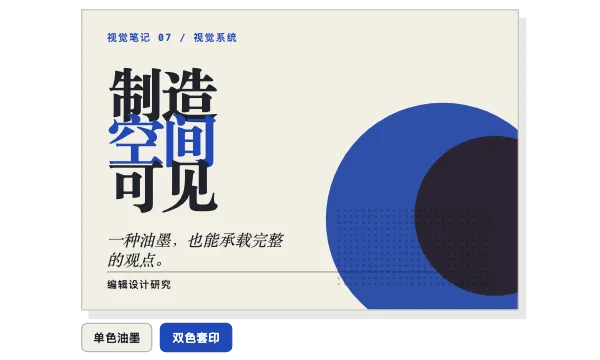
Mono-color Editorial Print单色编辑印刷
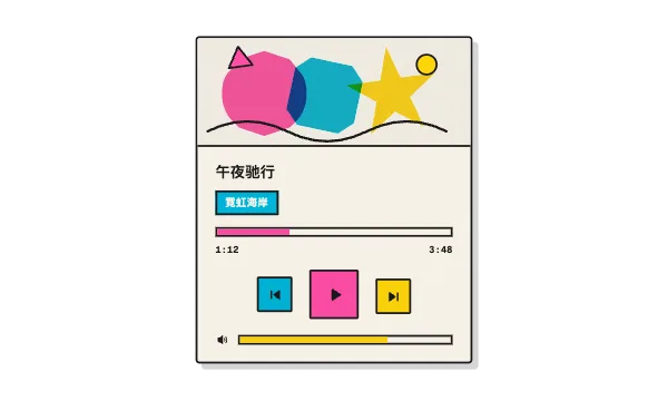
Risograph孔版印刷风(Risograph / Riso)
This is Mono-color Editorial Print because the composition is governed first by editorial hierarchy, one dominant ink, and intentional empty paper; print texture supports that system instead of becoming the whole subject.
这是单色编辑印刷,因为第一优先级是编辑层级、单一主油墨和有意识的纸张留白;印刷质感服务于这个系统,而不是成为唯一主题。
It would become Risograph if overlapping fluorescent spot-color shapes, visible multi-pass misregistration, and stencil-like ink behavior became the primary identity rather than editorial typography and restrained composition.
如果荧光专色叠加、明显的多次套印错位和模板化油墨行为成为主要身份,而不是编辑排版与克制构图,它就会变成 Risograph。
In code — optional starting points代码写法 —— 可选起点
Single-ink halftone screen
background-color: #f3efe5; background-image: radial-gradient(circle, #2148b8 0 1px, transparent 1.2px); background-size: 5px 5px; mix-blend-mode: multiply;Localized second-pass registration offset
.second-pass { color: #e55d2b; transform: translate(2px, -1px); mix-blend-mode: multiply; }Editorial headline with controlled cropping
font: 800 clamp(3rem, 12vw, 9rem)/.82 var(--display-serif); letter-spacing: -.035em; max-width: 7ch; overflow-wrap: normal;Style brief — paste into your agent风格 Brief —— 粘贴给你的代理
Create the visual in a Mono-color Editorial Print system. Start with warm uncoated paper (#F3EFE5) and one dominant named ink such as ultramarine #2148B8, signal red #C83232, plant green #008A4B, or charcoal #30343A. Build hierarchy with oversized editorial typography: one cropped or overlapping display headline, restrained supporting text, and small publication metadata. Preserve 25–55% visible empty paper. Convert photography or illustration into one-ink halftone dots, dry grain, screened tints, and simplified cutouts; recompose the source image together with the type instead of applying a filter to the original layout. If the message needs a second color, use one proven spot-ink pair and treat it as a physical second pass with only 1–2px of localized registration drift. Avoid gradients, neon, glossy photorealism, cinematic hero lighting, generic glass cards, decorative badges, and dense center-aligned symmetry. Keep body copy on clean paper, focus states visible, and all essential meaning legible without texture or color.
按单色编辑印刷系统创建视觉。以暖色未涂布纸张(#F3EFE5)和一种主油墨开始,例如群青 #2148B8、信号红 #C83232、植物绿 #008A4B 或炭黑 #30343A。用超大编辑字体建立层级:一个裁切或压过图像的展示标题、克制的辅助文字和小号出版物元数据。保留 25–55% 可见纸张留白。把照片或插画转化为单色半色调网点、干颗粒、筛网色调和简化剪影;让源图像与文字一起重新构图,不要只给原版式套滤镜。如果信息需要第二种颜色,只使用一组验证过的专色搭配,把它当成第二道实体印刷,并只在局部保留 1–2px 套印偏移。避免渐变、霓虹、光泽写实摄影、电影式布光、通用玻璃卡片、装饰徽章和拥挤的居中对称。正文放在干净纸张上,焦点状态清晰,所有重要信息即使没有纹理和颜色也能读懂。
Accessibility & misuse可访问性与误用
Halftone texture can reduce the effective contrast of text and faces. Keep body copy on a solid paper field and measure at least 4.5:1 contrast between the ink and the lightest paper region.
半色调纹理会降低文字和人物的实际对比度。正文请放在实心纸张区域,并确认油墨与最浅纸张区域之间达到至少 4.5:1 的对比度。
Large cropped display type can be visually expressive while the actual heading remains complete in the DOM. Do not split words into inaccessible fragments or use decorative text as the only heading.
大标题可以在视觉上裁切,但 DOM 中的真实标题必须完整。不要把单词拆成辅助技术无法理解的碎片,也不要把装饰文字当成唯一标题。
Registration drift and animated print passes are decorative. Keep controls and status text aligned, and remove shifting or flicker under prefers-reduced-motion.
套印偏移和印刷过程动画属于装饰。控件和状态文字应保持对齐,并在 prefers-reduced-motion 下移除位移和闪烁。
Origin起源
This entry documents the Mono-color Skill demonstrated by Dreamer妍妍 in 2026: a reusable design system that packages a personal editorial-print taste into explicit rules for ink, typography, composition, imagery, and output. Its visual lineage draws from limited-color editorial design, halftone newspaper reproduction, risograph printing, and independent magazine covers, while the Skill format turns those references into repeatable AI instructions.
本条记录 Dreamer妍妍 在 2026 年展示的 Mono-color Skill:把个人的编辑印刷审美拆成油墨、字体、构图、图像和输出规则,封装成可复用的设计系统。它吸收有限配色编辑设计、半色调报纸复制、Risograph 印刷和独立杂志封面的视觉谱系,再用 Skill 形式把参考转化为可重复的 AI 指令。