
Vaporwave 蒸汽波(Vaporwave)
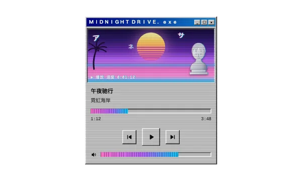
Vaporwave is the visual dialect of the early-2010s internet music microgenre of the same name: a collage of 1980s–90s consumer debris — pastel pink-to-cyan gradient skies, Greek marble busts, Japanese katakana, Windows 95 window chrome, palm-tree sunsets over grid floors — degraded with VHS scanlines, chromatic aberration, and glitch. It treats corporate-utopian imagery as found footage: dreamy, ironic, and worn. A nostalgia remix, not a period original.
蒸汽波是 2010 年代初网络同名音乐微流派的视觉方言:一幅 80–90 年代消费文化碎片的拼贴 —— 粉到青的粉彩渐变天空、希腊大理石雕像、日文片假名、Windows 95 窗口边框、网格地面上的棕榈树夕阳 —— 再叠上 VHS 扫描线、色差和故障效果做旧。它把企业乌托邦式的图像当现成素材带用:梦幻、讽刺、带着磨损感。是怀旧 remix,不是年代原作。
Scope: Covers the visual remix aesthetic, not the music's chopped-and-screwed production. The neon-outrun cousin that shares the sunset grid is synthwave/retrofuturism; the genuine turn-of-millennium original it samples is Y2K Digital Aesthetic (its own entry), and GeoCities-era amateur pages belong to Vernacular Web.
范围:只讲这套视觉 remix 美学,不讲音乐上的 chopped-and-screwed 制作手法。共享夕阳网格的霓虹表亲是 synthwave/retrofuturism;它采样的千禧年原作是 Y2K 数字美学(另见该条),GeoCities 时代的业余主页则归民间网页。
标本可交互,可以直接操作。
If you called it…如果你管它叫……
Full style DNA完整风格 DNA
-
Pink-to-cyan gradient skies粉到青的渐变天空 color defining定义特征
The Floral Shoppe wash: cyan #01cdfe at the horizon bleeding through pink #ff71ce and purple #b967ff into deep indigo night. Applied to skies, washes, and type fills — never to chrome or metal.
《Floral Shoppe》式的晕染:地平线处的青 #01cdfe 穿过粉 #ff71ce、紫 #b967ff,融进深靛蓝的夜空。用在天空、罩染和字体填充上 —— 绝不用于铬或金属。
-
Greek marble statuary希腊大理石雕像 imagery defining定义特征
White-to-grey classical busts, heads, and torsos floating in the composition, sometimes sliced, masked, or duplicated. Antiquity is sampled like stock footage — the statue is the mascot.
白到灰的古典半身像、头像和躯干漂浮在构图里,有时被切开、蒙版或复制。古典被当成素材带采样 —— 雕像就是吉祥物。
-
Windows 95 window chromeWindows 95 窗口边框 surface defining定义特征
Battleship-grey #c0c0c0 panels with 1–2px hard bevels, blue-gradient title bars, pixel icons, and dialog boxes used as decoration. The dead desktop is a collage element, not a working UI.
战舰灰 #c0c0c0 面板配 1–2px 硬斜角、蓝色渐变标题栏、像素图标,对话框被当作装饰。死去的桌面是拼贴素材,不是拿来用的 UI。
-
Katakana and full-width latin片假名与全角拉丁 typography defining定义特征
Japanese katakana — occasionally Chinese signage — placed as pure decoration, beside full-width spaced latin (AESTHETIC). Meaning is optional; the exotic-mood texture is the point.
日文片假名 —— 偶尔是中文招牌字 —— 纯当装饰摆放,旁边配全角空格拉丁(AESTHETIC)。意思可有可无,异域氛围的质感才是重点。
-
VHS decayVHS 磨损 surface defining定义特征
1px horizontal scanlines, chromatic aberration (RGB-split edges), tracking bands, tape noise, PLAY overlays and timestamps. Everything looks copied, worn, and re-recorded rather than rendered clean.
1px 水平扫描线、色差(RGB 分色边缘)、磁迹跟踪纹、磁带噪点、PLAY 叠印和时间码。一切看起来都像被翻录、磨损、再录过,而不是干净渲染出来的。
-
Striped sun and grid floor条纹夕阳与网格地面 imagery supporting辅助特征
A striped or pixelated sun setting over a perspective grid plane, usually with palm silhouettes — borrowed from synthwave but washed out to pastel.
条纹或像素化的太阳落在透视网格平面上,通常配棕榈树剪影 —— 借自 synthwave,但洗成了粉彩。
-
Glitch and drift故障与漂移 motion supporting辅助特征
Elements slice-shift, stutter, and RGB-split in short loops; motion feels like a damaged tape, never a smooth physics animation.
元素短循环地切片错位、卡顿、RGB 分色;动效像一盘受损的磁带,绝不是顺滑的物理动画。
-
Chrome-and-gel futurism铬与凝胶未来主义 surface avoid避免
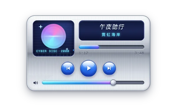
Mirror chrome, gel gloss, lens flares, and iridescent blue-silver belong to Y2K's forward-looking sheen. Vaporwave surfaces stay matte, faded, and degraded — polish kills the nostalgia.
镜面铬、凝胶高光、镜头光晕和幻彩蓝银属于 Y2K 向前看的光泽。蒸汽波的表面保持哑光、褪色、磨损 —— 抛光会杀死怀旧。
Often confused with: Y2K Digital Aesthetic最容易混淆:Y2K 数字美学
Vaporwave蒸汽波(Vaporwave)
Y2K Digital AestheticY2K 数字美学
This is Vaporwave because it looks BACK: a 2010s remix of 80s/90s debris — pink-to-cyan gradient skies, marble busts, katakana, Windows 95 chrome, and VHS wear — nostalgia as collage, not millennium optimism.
这是蒸汽波,因为它在回望:一套 2010 年代对 80/90 年代碎片的 remix —— 粉到青的渐变天空、大理石雕像、片假名、Windows 95 边框和 VHS 磨损 —— 是怀旧拼贴,不是千禧年的乐观。
It would become Y2K if the gaze flipped forward: drop the busts, katakana, and tape decay, and re-render everything in mirror chrome, gel plastic, and iridescent blue-silver as if the future had just shipped.
如果把视线调转向未来:拿掉雕像、片假名和磁带磨损,把一切都重新渲染成镜面铬、凝胶塑料和幻彩蓝银,仿佛未来刚刚到货 —— 就变成 Y2K 数字美学了。
In code — optional starting points代码写法 —— 可选起点
Sunset gradient under a scanline overlay
background: repeating-linear-gradient(0deg, rgba(0,0,0,.22) 0 1px, transparent 1px 3px), linear-gradient(180deg, #2d1b69 0%, #b967ff 40%, #ff71ce 68%, #01cdfe 100%);Windows 95 raised bevel (buttons, panels, windows)
background: #c0c0c0; box-shadow: inset -1px -1px 0 #0a0a0a, inset 1px 1px 0 #fff, inset -2px -2px 0 #808080, inset 2px 2px 0 #dfdfdf;Chromatic-aberration type
color: #fff; text-shadow: -2px 0 #ff71ce, 2px 0 #01cdfe;Style brief — paste into your agent风格 Brief —— 粘贴给你的代理
Create the surface using Vaporwave. Defining signals: gradient sky running cyan #01cdfe at the horizon through pink #ff71ce and purple #b967ff into indigo #2d1b69; floating white Greek marble statuary; Windows 95 chrome — #c0c0c0 panels with hard 1–2px bevels (inset -1px -1px 0 #0a0a0a, inset 1px 1px 0 #fff), blue-gradient title bars, square corners, zero blur; decorative Japanese katakana plus full-width spaced latin (AESTHETIC); VHS decay — 1px scanlines at ~20% black, chromatic aberration (text-shadow: -2px 0 #ff71ce, 2px 0 #01cdfe), glitch slice-shifts; a striped sun over a perspective grid floor with palm silhouettes. Keep the choice of consumer fragments (logos, mall imagery) flexible. Type: small plain system sans, black on the grey chrome, white with RGB split over the art. Do not drift into Y2K: the decisive difference is gaze direction — vaporwave looks BACK at the 80s/90s through worn tape, so no mirror chrome, gel gloss, or iridescent blue-silver. Hold text at 4.5:1 on solid plates (never over scanlines), glitch under 3 flashes/sec, and honor prefers-reduced-motion.
用蒸汽波(Vaporwave)创建界面。定义性信号:渐变天空从地平线的青 #01cdfe 穿过粉 #ff71ce、紫 #b967ff 进入靛蓝 #2d1b69;漂浮的白色希腊大理石雕像;Windows 95 边框 —— #c0c0c0 面板配 1–2px 硬斜角(inset -1px -1px 0 #0a0a0a、inset 1px 1px 0 #fff)、蓝色渐变标题栏、直角、零模糊;装饰性日文片假名加全角空格拉丁(AESTHETIC);VHS 磨损 —— 约 20% 黑的 1px 扫描线、色差(text-shadow: -2px 0 #ff71ce, 2px 0 #01cdfe)、故障切片错位;条纹太阳落在透视网格地面上,配棕榈剪影。具体用哪些消费碎片(logo、商场意象)保持灵活。字体:小号朴素系统无衬线,灰色边框面上黑字,画面上白字带 RGB 分色。不要滑向 Y2K:决定性区别是视线的方向 —— 蒸汽波隔着磨损的磁带回望 80/90 年代,所以不要镜面铬、凝胶高光或幻彩蓝银。文字在实色底板上保持 4.5:1(绝不压在扫描线上),故障闪烁低于每秒 3 次,并响应 prefers-reduced-motion。
Accessibility & misuse可访问性与误用
Pastel-on-pastel is the core failure: pink text over the cyan or purple gradient reads around 1.5–2:1. Put body text on the solid #c0c0c0 chrome (black ink, 15:1+) or on solid dark plates over the art, and treat gradient or chromatic type as decoration with a readable duplicate.
粉彩撞粉彩是核心翻车点:粉字压在青或紫渐变上,对比度大约只有 1.5–2:1。正文要放在实色 #c0c0c0 边框面上(黑字,15:1 以上)或画面上方的实色深底板;渐变字、色差字只当装饰,配一份可读的副本。
Glitch strobes, slice-shifts, and RGB-split flicker can trigger photosensitive reactions — keep any flashing under 3 per second, disable slice-shifts and flicker under prefers-reduced-motion, and never gate content behind the effect.
故障频闪、切片错位和 RGB 分色抖动可能诱发光敏反应 —— 任何闪烁控制在每秒 3 次以内,prefers-reduced-motion 下关闭错位和闪烁,永远别把内容藏在这些效果后面。
Decorative katakana and full-width latin are meaningless to many users and get spelled out character-by-character by screen readers — mark them aria-hidden. Scanline and noise overlays cut effective contrast for low-vision users, so keep those layers out of text.
装饰性片假名和全角拉丁对很多用户没有意义,还会被读屏器逐字拼读 —— 给它们标 aria-hidden。扫描线和噪点叠加会拉低低视力用户的有效对比度;让这些图层避开文字。
Origin起源
Vaporwave began as a music microgenre around 2010–2011 in online communities — Bandcamp, Tumblr, and their forums — with Daniel Lopatin's Eccojams Vol. 1 (2010, released under the alias Chuck Person) and the Macintosh Plus album Floral Shoppe (2011, an alias of producer Vektroid) as founding documents; the Floral Shoppe cover — pink wash, marble bust, katakana — set the visual template. James Ferraro's Far Side Virtual (2011) supplied the corporate-utopia source material, and the name puns on 'vaporware'. The collage aesthetic peaked on Tumblr around 2012–2015.
蒸汽波约 2010–2011 年起源于线上社区(Bandcamp、Tumblr 及其论坛)的音乐微流派,奠基作包括 Daniel Lopatin 以 Chuck Person 化名发行的《Eccojams Vol. 1》(2010)和 Macintosh Plus(制作人 Vektroid 的化名)的《Floral Shoppe》(2011)—— 后者的封面(粉色罩染、大理石雕像、片假名)定下了视觉模板。James Ferraro 的《Far Side Virtual》(2011)提供了企业乌托邦素材,名字本身是对「vaporware」的双关。这套拼贴美学 2012–2015 年前后在 Tumblr 上达到顶峰。