
Web Brutalism 网页粗野主义
Web Brutalism treats the browser's own materials as the finished surface: default or system fonts, unstyled-looking links, visible document structure, plain borders and horizontal rules, and density over polish. Nothing pretends to be anything else — no gradients imitating glass, no shadows imitating depth. At its best it's honest and fast (Craigslist, Hacker News, early-web personal sites); at its worst the label gets stretched over anything unpolished.
网页粗野主义把浏览器自带的材料当作最终成品表面:默认或系统字体、看上去没加样式的链接、清晰可见的文档结构、朴素的边框和水平分隔线,以及重密度轻修饰。没有任何东西假装成别的东西——没有模仿玻璃的渐变,也没有假装深度的阴影。做得好时它诚实而飞快(Craigslist、Hacker News、早期网络的个人网站);做得差时,这个标签会被随便贴在任何不精致的东西上。
Scope: Distinct from architectural Brutalism (exposed concrete and mass — the analogy's source), and from Neobrutalism (a styled, saturated, thick-border graphic look that is anything but default). The nostalgic table-and-GIF personal-site look is Vernacular Web, a separate (future) entry.
范围:不同于建筑上的粗野主义(裸露的混凝土与体量——正是这个类比的来源),也不同于新粗野主义(一种经过设计、色彩饱和、粗边框的图形化外观,跟「默认」毫不沾边)。那种怀旧的表格加 GIF 个人网站风是民间网页(Vernacular Web),另立条目(待出)。
标本可交互,可以直接操作。
If you called it…如果你管它叫……
Full style DNA完整风格 DNA
-
Browser-default materials浏览器默认材料 typography defining定义特征
Times/system serif or monospace, default-blue underlined links, visited-purple — the stack looks unstyled even when it's deliberate.
Times/系统衬线体或等宽字体,默认蓝色带下划线的链接,访问后变紫——哪怕是刻意为之,整套东西看上去也像没加样式。
-
Exposed document structure裸露的文档结构 layout defining定义特征
The page reads as a document: headings, lists, tables, and <hr> dividers in source order — structure IS the layout.
页面读起来就是一份文档:标题、列表、表格和 <hr> 分隔线按源码顺序排开——结构本身就是布局。
-
Zero decorative rendering零装饰性渲染 depth defining定义特征
No shadows, gradients, rounded corners, or imitation materials; at most 1px solid borders. Flat white (or single-color) ground.
没有阴影、渐变、圆角或仿材质;最多 1px 实线边框。底色就是纯白(或单一颜色)。
-
Utility-first density实用优先的高密度 layout defining定义特征
Information is packed tight and loads instantly — the aesthetic argument is speed and honesty, not beauty.
信息塞得紧、加载快——它的美学主张是速度和诚实,不是漂亮。
-
Monospace / all-caps accents等宽 / 全大写点缀 typography variable可变特征
Many brutalist sites swap to monospace or shouting caps for flavor; others stay pure serif. Both count.
很多粗野主义网站换成等宽字体或用「喊叫式」全大写来调味;也有坚持纯衬线的。两种都算数。
-
Styled 'rawness'被设计出来的「生」 color avoid避免
Saturated color blocks, thick designed borders, and hard offset shadows are a costume of rawness — that's Neobrutalism.
饱和色块、粗重的设计感边框和生硬偏移阴影是「生」的戏服——那是新粗野主义。
Often confused with: Neobrutalism最容易混淆:新粗野主义
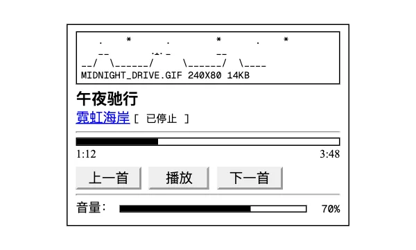
Web Brutalism网页粗野主义
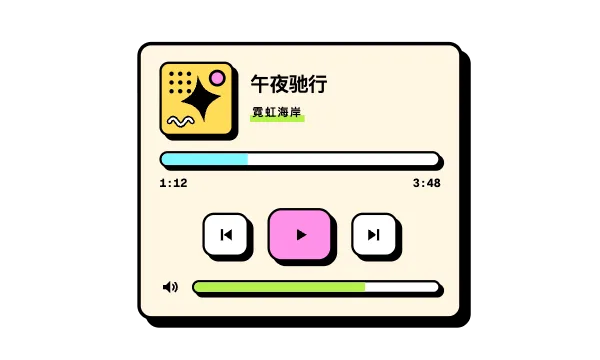
Neobrutalism新粗野主义
This is Web Brutalism because the page is genuinely built from browser defaults — system type, blue links, bare structure, no decorative rendering at all.
这是网页粗野主义,因为页面确实是用浏览器默认值搭出来的——系统字体、蓝色链接、裸露的结构,完全没有装饰性渲染。
It would become Neobrutalism if the rawness were styled: saturated color blocks, thick uniform black borders, hard offset shadows, and chunky display type — a designed graphic language, not defaults.
如果这份「生」是被设计出来的——饱和色块、统一的粗黑边框、生硬偏移阴影、粗壮展示字体,一套设计出来的图形语言而不是默认值——它就变成新粗野主义了。
In code — optional starting points代码写法 —— 可选起点
The materials ARE the elements
<h1>, <hr>, <table>, <ul> with UA default stylesIf you must write CSS, restate the defaults
font-family: 'Times New Roman', serif; a { color: #0000ee; } a:visited { color: #551a8b; }Style brief — paste into your agent风格 Brief —— 粘贴给你的代理
Create the page using strict Web Brutalism. Defining signals: browser-default materials (Times/system serif or monospace, default-blue underlined links); exposed document structure — headings, lists, tables, horizontal rules in source order; zero decorative rendering (no shadows, gradients, or rounded corners; at most 1px solid borders on a plain ground); utility-first density that loads instantly. Keep monospace vs serif and all-caps accents flexible. Use semantic HTML with minimal CSS — default UA styles are the design; resist resets that soften them. Do not drift into Neobrutalism; the decisive difference is that nothing here is styled to look raw — saturated blocks, thick designed borders, and offset shadows would make it a graphic costume. Preserve readable text sizes, focus visibility, and honest link affordances (underlines stay).
用严格的网页粗野主义创建页面。定义性信号:浏览器默认材料(Times/系统衬线体或等宽字体、默认蓝色带下划线链接);裸露的文档结构——标题、列表、表格、水平分隔线按源码顺序排开;零装饰性渲染(不要阴影、渐变、圆角;纯色底上最多 1px 实线边框);实用优先、瞬间加载的高密度。等宽还是衬线、全大写点缀都保持灵活。用语义化 HTML 加极少量 CSS——UA 默认样式就是设计本身;不要引入会软化它们的 reset。不要滑向新粗野主义;决定性区别在于这里没有任何东西被设计成「看起来生」——饱和色块、粗重的设计感边框和偏移阴影会让它变成图形戏服。保持文字大小可读、焦点可见,以及诚实的链接可供性(下划线保留)。
Accessibility & misuse可访问性与误用
Brutalism is accidentally accessible — semantic structure, honest links, no contrast-eating decoration — as long as text sizes stay readable and density leaves tap targets big enough.
粗野主义是无心插柳的无障碍——语义化结构、诚实的链接、没有吃掉对比度的装饰——只要文字大小保持可读、密度别把点按目标挤得太小。
Default-blue on white passes contrast; keep the default focus outline (removing it would be the one truly anti-brutalist move).
默认蓝配白底对比度达标;保留默认的焦点轮廓(把它删掉才是真正反粗野主义的操作)。
Dense tables need proper headers/scope for screen readers — visual rawness doesn't excuse structural rawness.
密集的表格需要为屏幕阅读器配好 header/scope——视觉上的「生」不能成为结构偷懒的借口。
Origin起源
Named by analogy to architecture's béton brut ('raw concrete'); the web usage spread in the mid-2010s through Pascal Deville's brutalistwebsites.com and essays like Smashing Magazine's 'split personality of brutalist web development', as a reaction against the sameness of polished startup sites.
名字类比自建筑界的 béton brut(法语「裸混凝土」);2010 年代中期,这个用法通过 Pascal Deville 的 brutalistwebsites.com 和 Smashing Magazine 的「split personality of brutalist web development」等文章在网页圈传开,是对千篇一律的精致创业公司网站的反击。